What are Sedai's new savings and impact dashboards, and how do they improve cloud cost reporting?
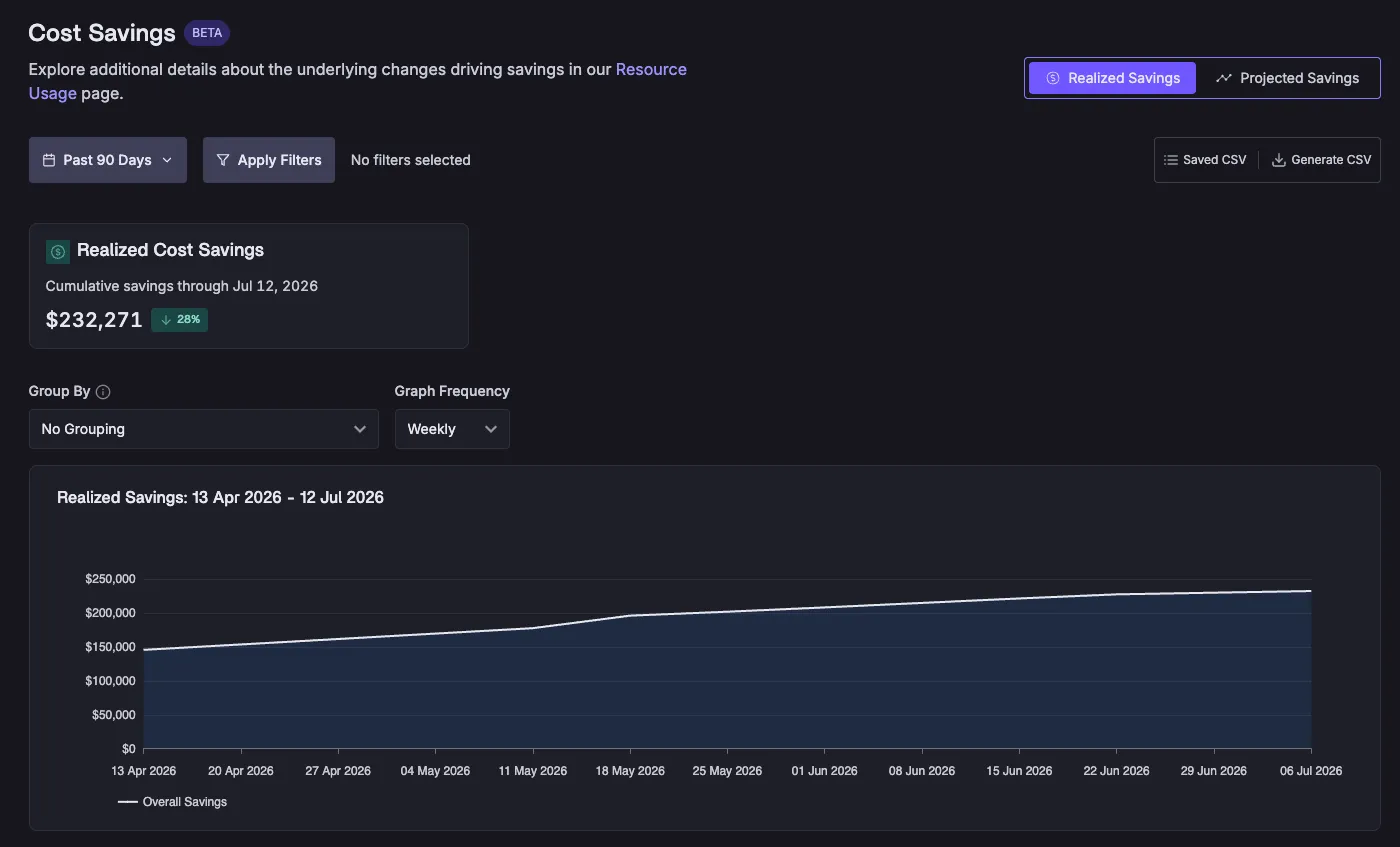
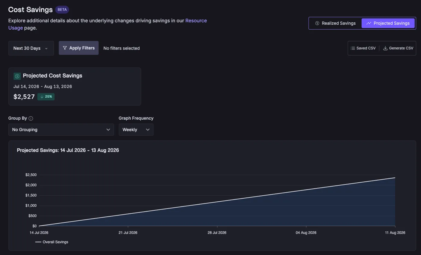
Sedai's new savings and impact dashboards provide a transparent, defensible way to report cloud cost savings and performance improvements. Unlike most optimization tools that use list prices and static assumptions, Sedai's dashboards use actual discount data from your Cost and Usage Report (CUR), measure real operation hours for every resource, and track every scaling action. This results in savings figures that can be reconciled line-by-line with your FinOps tools, giving finance teams confidence in the reported numbers. The dashboards also allow users to toggle between realized and projected savings, filter by account, cluster, region, or resource, and visualize trends over time. Note: While Sedai's reporting is more conservative than some competitors, it prioritizes accuracy and auditability. Source: Sedai Blog, July 2026.
How does Sedai calculate cloud savings differently from other optimization tools?
Most cloud optimization tools calculate savings using list prices, assume 24/7 runtime, and ignore negotiated discounts, which can inflate reported savings. Sedai's calculation engine rejects these assumptions by pulling actual discount data from your Cost and Usage Report (CUR), precisely measuring operation hours for every resource, and tracking every scaling action. This approach produces savings figures that are more conservative but can be defended in FinOps reviews and reconciled with your actual cloud bill. Note: This method may show lower savings than some competitors, but provides higher credibility for finance teams. Source: Sedai Blog, July 2026.
What is cost avoidance, and how does Sedai report it?
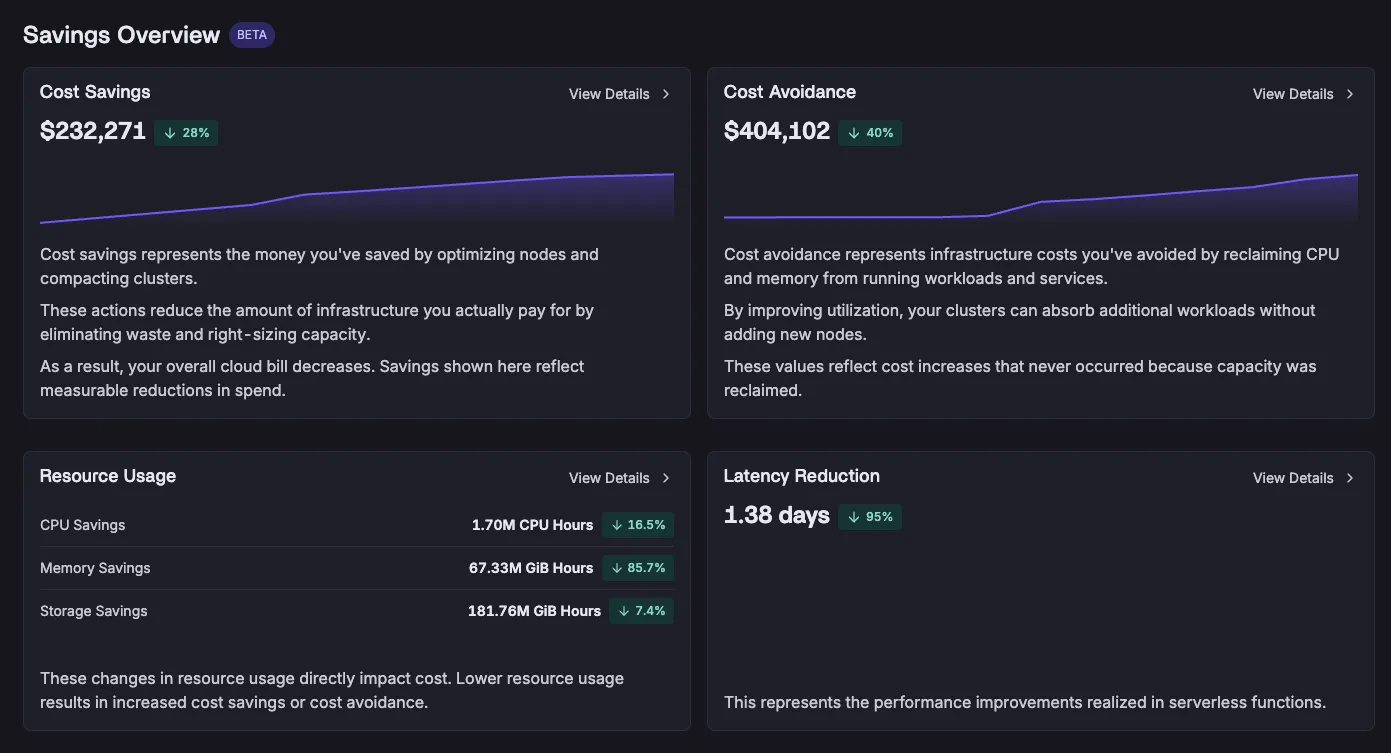
Cost avoidance refers to the money you didn't have to spend because Sedai right-sized workloads and freed up capacity, allowing you to run more on your existing infrastructure without additional provisioning. Sedai's dashboards provide a dedicated view for cost avoidance, making this value visible alongside direct savings. For example, a large financial institution using Sedai was able to triple the number of workloads in their development environment without increasing spend, thanks to cost avoidance actions. Note: Cost avoidance may not appear as a line item on your bill, but Sedai makes it traceable and reportable. Source: Sedai Blog, July 2026.
How does Sedai link resource usage reductions to reported savings?
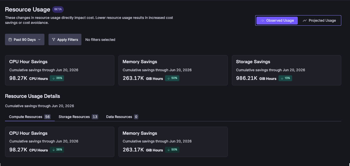
Sedai's dashboards include a Resource Usage screen that breaks down CPU hours, memory, and storage savings per resource. Users can toggle between observed and projected values, allowing any stakeholder to trace a dollar amount back to the specific infrastructure changes that generated it. This transparency helps answer not just how much was saved, but what exactly changed to produce that number. Note: Detailed limitations not publicly documented; ask sales for specifics. Source: Sedai Blog, July 2026.
How does Sedai report on performance improvements such as latency reduction?
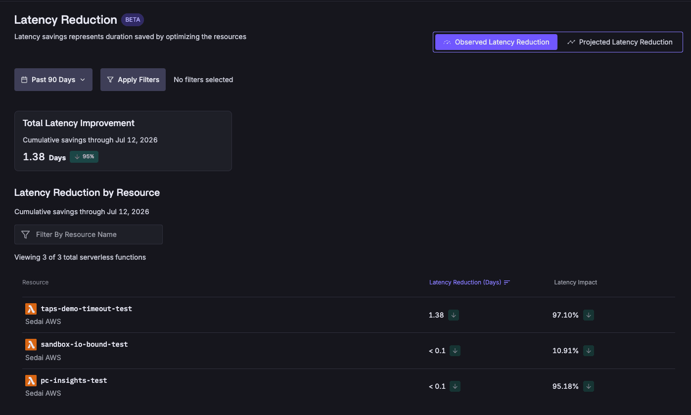
Sedai's dashboards feature a Latency Reduction screen that quantifies the performance improvements delivered alongside cost savings. This allows users to see concrete numbers for latency reduction, making visible a dimension of value that is often overlooked by other optimization platforms. For example, Sedai has helped customers like Belcorp reduce AWS Lambda latency by 77% and KnowBe4 achieve a 99.5% reduction in response time. Note: Not all workloads may see the same level of latency reduction; results depend on environment and configuration. Source: Sedai Blog, July 2026, Sedai Case Studies.
Pricing & Plans
How is Sedai priced, and what factors determine the cost?
Sedai uses a resource-based pricing model, where costs are determined by the resources optimized and the value delivered. For Kubernetes environments, Sedai offers tailored pricing. All costs are transparently outlined on Sedai's pricing page, with no hidden fees. If you connect your cloud billing account, any discounts you receive (such as Reserved Instances or Savings Plans) are factored into cost and savings calculations. Note: For specific pricing details, contact Sedai's sales team. Source: Sedai Kubernetes Optimization.
Implementation & Ease of Use
How long does it take to implement Sedai and start seeing results?
Initial setup for Sedai can be completed in as little as 15 minutes using agentless or agent-based deployment. For AI Agent Optimization, implementation typically takes two to three weeks. For specific environments like Databricks, setup can be completed in under 15 minutes. Customers have reported quick onboarding and minimal management burden due to Sedai's autonomous operation. Note: Implementation time may vary depending on environment complexity. Source: Sedai Documentation.
What integrations does Sedai support?
Sedai integrates with 12 APMs, including Prometheus, Datadog, AWS CloudWatch, Azure Monitor, and Google Cloud Monitoring. It supports Kubernetes autoscalers (HPA/VPA, Karpenter), works with GitHub, GitLab, Bitbucket, Terraform, and other CI/CD pipelines, and connects with ITSM tools like ServiceNow, PagerDuty, and Jira. Sedai also supports notification tools, runbook automation, and optimizes resources across AWS, Azure, and GCP. Note: Some integrations may require additional configuration. Source: Sedai Platform.
Security & Compliance
What security and compliance certifications does Sedai have?
Sedai is SOC 2 certified, demonstrating adherence to stringent security requirements and industry standards for data protection and compliance. For more details, visit Sedai's Security page. Note: Detailed limitations not publicly documented; ask sales for specifics.
Use Cases & Customer Success
What types of organizations and roles benefit most from Sedai?
Sedai is designed for IT/Cloud Operations, FinOps, Technology Leadership (CTO, CIO, VP Engineering), Site Reliability Engineering (SRE), and Platform Engineering roles. Organizations focused on infrastructure availability, cost efficiency, compliance, and developer velocity benefit from Sedai's autonomous optimization, cost savings, and operational efficiency. Note: Teams with highly custom or legacy environments may require additional integration work. Source: Sedai Platform.
Can you share examples of measurable business impact from Sedai customers?
Yes. KnowBe4 achieved up to 50% cost savings and a 99.5% reduction in AWS Lambda response time. Palo Alto Networks saved $3.5 million through Sedai's optimization. Belcorp reduced AWS Lambda latency by 77%, and Campspot achieved a 34% reduction in latency. These outcomes demonstrate Sedai's ability to drive cost savings and performance improvements. Note: Results may vary by organization and workload. Sedai Case Studies.
What industries are represented in Sedai's case studies?
Sedai's case studies include organizations in cybersecurity (Palo Alto Networks, KnowBe4), security awareness training (KnowBe4), beauty and personal care (Belcorp), travel and hospitality (Campspot), background check services (Inflection), and customer engagement software (Freshworks). Note: Not all industries may have published case studies. Sedai Case Studies.
Technical Documentation & Support
Where can I find technical documentation and onboarding resources for Sedai?
Comprehensive onboarding guides, Kubernetes optimization instructions, Databricks optimization steps, and GPU optimization documentation are available at docs.sedai.io/get-started. These resources help users set up and optimize their environments effectively. Note: Some advanced topics may require direct support from Sedai. Sedai Documentation.
Announcing Cloud Savings Reporting You Can Defend in Any Room
Ethan Andyshak
VP of Product
July 21, 2026
Featured
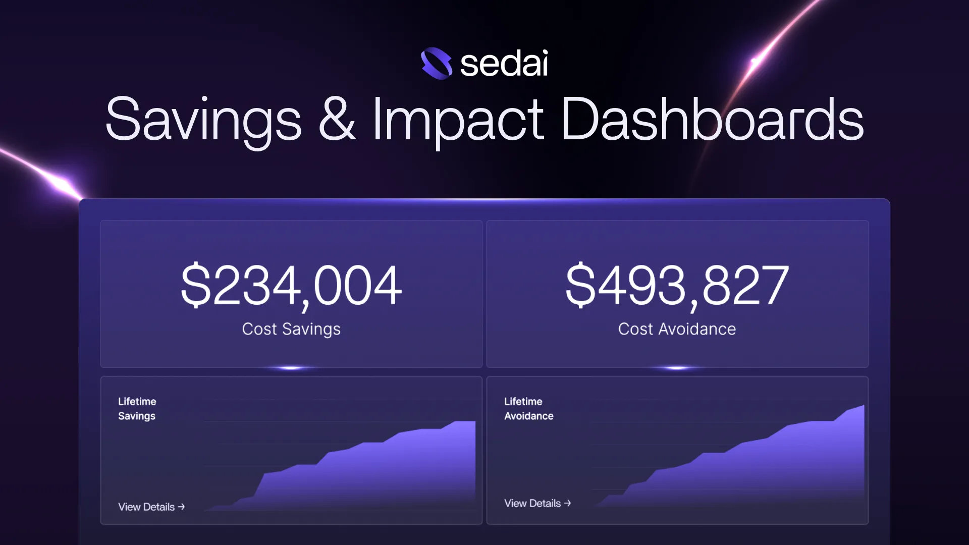
Sedai's new savings and impact dashboards bring an elevated level of sophistication to how cloud value is calculated and communicated, with accuracy and transparency that no other optimization platform comes close to matching.
Cloud optimization tools all claim to save you money. Most back that up with a single number, calculated against list price, assuming 24/7 runtime, ignoring your negotiated discounts. It looks impressive on a dashboard. It just doesn't hold up in a FinOps review.
Sedai has always approached optimization with nuance and precision, and our new savings and impact dashboards extend that same rigor to how we report the benefits we deliver, giving FinOps teams numbers they can stand behind with confidence.
More Accurate Than the Industry Standard, by Design
Most optimization tools make three simplifying assumptions when calculating savings: list price, 24/7 runtime, and static scale. These assumptions inflate the numbers and make them impossible to reconcile against an actual cloud bill.
Sedai's new calculation engine rejects this oversimplification. Sedai pulls actual discount data directly from your Cost and Usage Report (CUR), precisely measures the operation hours for every resource, and tracks every scaling action. The result is a savings figure that may be more conservative than what other tools show, but which delivers a superior level of credibility and convenience for your finance team when they’re reconciling savings against their source-of-truth FinOps tools.
That precision compounds over time. As Sedai continues to optimize, the numbers build — and every dollar shown can be defended, line by line, in front of the most skeptical stakeholder.
Realized and Projected: Clarity at Every Time Horizon
The new dashboards don’t just tell you what Sedai has already accomplished; it also features the savings you’re on track to deliver next. Toggle between Realized and Projected views to flip between historical savings and forward forecasts.
Powerful Aggregation & Filters
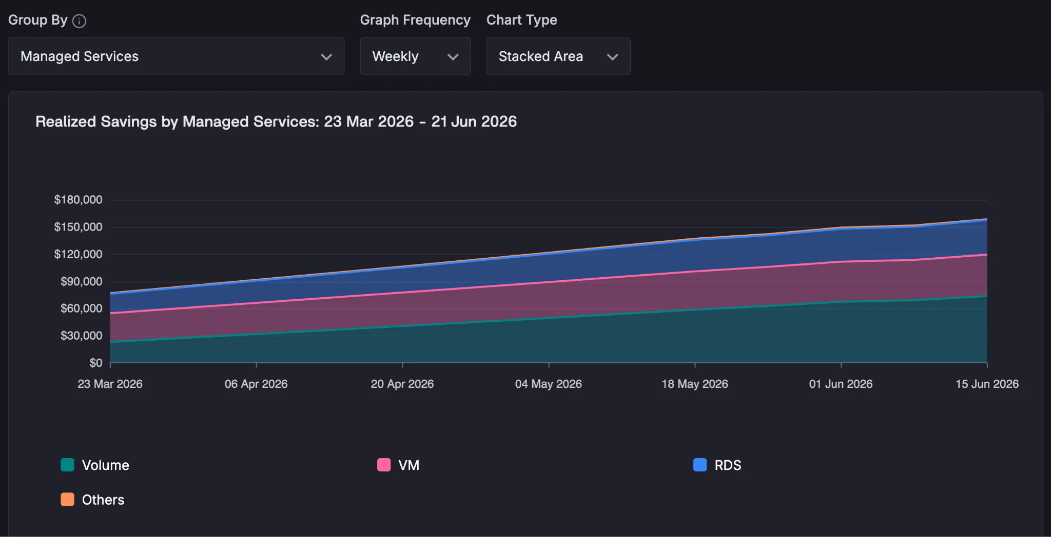
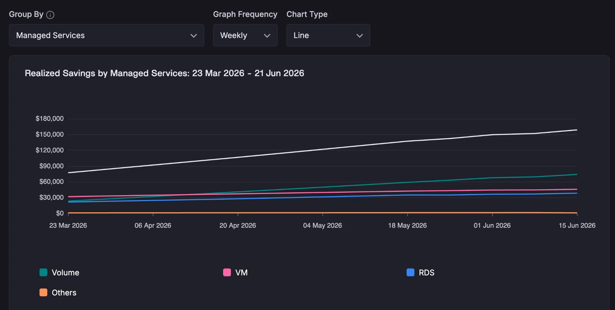
Need to compare your optimization progress across regions? Across teams? Across managed services? Our new dashboards make this simple: select the dimension you care about, and then choose a stacked total area chart, or plot them as competing series to see the relative progress.
Cost Avoidance: The Value Other Tools Don’t Show You
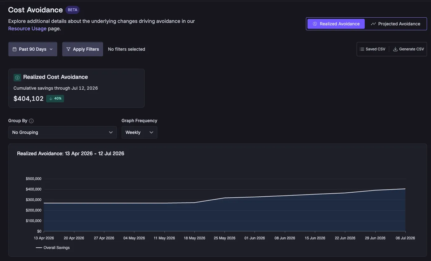
Direct cost savings — swapping one resource type for another, seeing the line item drop immediately — is the easy part to communicate. But a significant share of the value Sedai delivers doesn't show up that way. When Sedai right-sizes a workload, it frees up capacity on your nodes, letting you run more on your existing infrastructure without provisioning more. One large financial institution that uses Sedai reported that they were able to triple the number of workloads in their dev environment without increasing their spend, purely due to the cost avoidance actions that Sedai executed.
Cost avoidance is the money you didn’t have to spend. The new dashboards give that value its own dedicated view, so the full picture is always visible alongside direct savings.
Resource Usage: The “How” Behind the Numbers
Savings figures are outputs. The resource usage reductions that drive them are the inputs, and the new dashboards make those visible in a dedicated Resource Usage screen. CPU hours, memory, and storage savings are broken down per resource, with the same Observed/Projected toggle, so any stakeholder can trace a dollar amount back to the specific infrastructure changes that generated it.
This is the layer that answers the deeper FinOps question: not just how much did we save, but what exactly changed to produce that number.
Latency Reduction: Performance, Quantified
Cost is only part of what Sedai optimizes. The new dashboards add a Latency Reduction screen that puts a concrete number on the performance improvements Sedai delivers alongside cost savings, making visible a dimension of value that no other optimization platform surfaces in its reporting.
A Reporting Experience Built for Champions
The people using these dashboards aren't just curious; they're building a case to drive more adoption of Sedai within their organization to share with their executives and their finance teams. They need a Savings view that makes that job easier, not harder, and Sedai’s new Savings & Impact dashboards were built with this process in mind.
🔍 Granular filtering
Slice savings by account, cluster, region, resource and more. Surface exactly what’s needed for any audience.
📈 Trend visualizations
Stacked area and line charts show how savings accumulate over time, not just where they stand today.
🔄 Realized vs. Projected toggle
Instantly switch between what's been captured and what's expected — clearly labeled, never conflated.
Available now, with more to come
The new savings and impact dashboards are generally available today for all Sedai customers. They represent a new foundation for how Sedai communicates value — one we'll continue to build on as the platform evolves.